Air quality categories help us understand air quality and modify our activities if pollution levels are high.
Air quality categories (AQC) are colour indicators used to summarise air quality measurements. In New South Wales, five colour indicators are used to classify air quality as either 'Good', 'Fair', 'Poor', 'Very Poor' or 'Extremely Poor'.
The AQC is determined by measurements of key air pollutants we monitor at our monitoring locations.
How we measure and report air quality data
1. Collect data from each site
Monitoring and reporting air quality starts with data measurements from our network of air quality sensors and instruments at monitoring stations around New South Wales.
Data measurement readings are numbers with measurement units, from scientific instruments for each air pollutant we measure. The measurement units for the different pollutants and visibility are in the table below.
Pollutant/Visibility | Symbol | Measurement unit |
|---|---|---|
Ozone | O3 | Parts per hundred million (pphm) |
Nitrogen dioxide | NO2 | Parts per hundred million (pphm) |
Carbon monoxide | CO | Parts per million (ppm) |
Sulphur dioxide | SO2 | Parts per hundred million (pphm) |
Particles: less than 2.5 micrometres diameter (small); less than 10 micrometres diameter (large) | PM2.5, PM10 | Micrograms per cubic metre (µg/m3) |
Visibility | Bsp | 10-4 m-1 |
2. Categorise air pollutant measurements
Hourly measurements are then classified into an air quality category for each pollutant. Each category has a different concentration range for every pollutant, meaning similar concentrations for two pollutants may be in two very different air quality categories. The categories each pollutant is given based on their measurements is known as the pollutant AQC.
The resulting categories, from 'Good' to 'Extremely Poor', are labelled and colour-coded for easy interpretation.
| Air quality categories (AQC) | ||||||
Air pollutant | Averaging period | Units | GOOD | FAIR | POOR | VERY POOR | EXTREMELY POOR |
Ozone | 1-hour | pphm | <6.7 | 6.7–10.0 | 10.0–15.0 | 15.0–20.0 | 20.0 and above |
8-hour rolling | pphm | <5 | 5–6.5 | 6.5–9.75 | 9.75-13 | 13.0 and above | |
Nitrogen dioxide | 1-hour | pphm | <8 | 8–12 | 12–18 | 18–24 | 24 and above |
Visibility | 1-hour | bsp | <1.5 | 1.5–3.0 | 3.0–6.0 | 6.0–18.0 | 18.0 and above |
Carbon monoxide CO | 8-hour rolling | ppm | <6.0 | 6.0–9.0 | 9.0–13.5 | 13.5–18.0 | 18.0 and above |
Sulphur dioxide | 1-hour | pphm | <13.3 | 13.3–20.0 | 20.0–30.0 | 30.0–40.0 | 40.0 and above |
Particulate matter | 1-hour | µg/m3 | <50 | 50–100 | 100–200 | 200–600 | 600 and above |
24-hour | µg/m3 | <33.5 | 33.5-50 | 50-75 | 75-100 | 100 and above | |
Particulate matter | 1-hour | µg/m3 | <25 | 25–50 | 50–100 | 100–300 | 300 and above |
24-hour | µg/m3 | <16.75 | 16.75-25 | 25-37.5 | 37.5-50 | 50 and above | |
3. Summarising air quality into AQCs
The hourly data measured at air quality stations determines the AQC for each pollutant. The highest pollutant AQC at each station becomes the station AQC, with the highest station AQC in each region becoming the regional AQC. This is stepped out further below by using air quality data from the Lidcombe station in the Central West Sydney region.
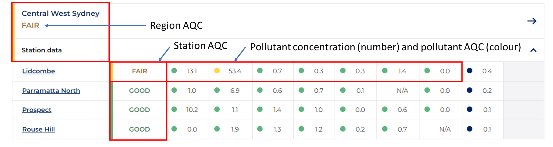
- Pollutant concentration and AQC categorise each pollutant measured at a site with one of the 5 colour codes. The colour code is determined by comparing the hourly measurement for each parameter against the cut-off values. In the graphic above, PM10 at Lidcombe is colour-coded yellow ('Fair' air quality) as the hourly measurement for PM10 falls in the 'Fair' category. Hourly measurements of all other parameters are 'Good' (green).
- Station AQC summarises air quality for a site, by comparing all pollutants measured at the site. It is determined from the highest category when comparing all pollutant AQCs at a site. In the graphic above, the highest category at Lidcombe site is colour-coded yellow, due to PM10, which corresponds to 'Fair' air quality.
- Regional AQC summarises air quality for each region (e.g. Central West Sydney). It is determined by the highest site AQC when comparing all sites across a region (hence each region has a colour-coded regional AQC). In the graphic, Regional AQC for Central West Sydney is colour-coded yellow because at Lidcombe station air quality is 'Fair' due to PM10 and has the highest site AQC when compared to other stations in the region.
.
What the air quality categories mean for you
The AQC colours provide information at a glance to help people plan their activities, as shown in the Environmental Health Standing Committee's Activity guide.
By using the AQC colours and following general health recommendations stated in the activity guide, you can take steps to limit your exposure to air pollution. For example, if the AQC at your local station is ‘Very Poor’, the health advice in the activity guide can assist you in understanding how this might affect your health and recommend actions to take.
Information for sensitive groups
Some people may be more sensitive to air pollution. Sensitive groups include people with lung disease or heart disease, children, older adults, pregnant women.
If you need information specific to people with asthma, visit the Asthma Australia website to access their free helpline.
Anyone with persistent symptoms should seek medical advice or call Health Direct Australia on 1800 022 222